Workforce Overview
The Workforce Overview is an analytics dashboard for managers and admins. It is split into two sections: a global section showing platform-wide data across all events, and an event-specific section showing data scoped to a selected event.
To access the dashboard, navigate to Workforce Overview in the side menu.
Global section
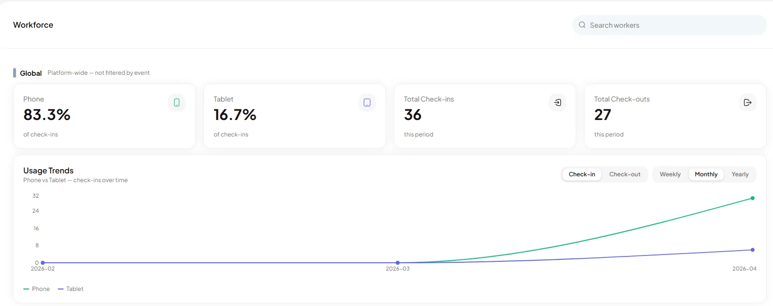
Section titled “Global section”The global section at the top of the dashboard shows platform-wide check-in metrics.
Formula tooltips New
Section titled “Formula tooltips ”NewHover over any data card to see a tooltip explaining the formula behind that metric. Tooltips are available for Attendance Rate and On Time Rate, showing exactly how each figure is calculated.
Check-in device breakdown
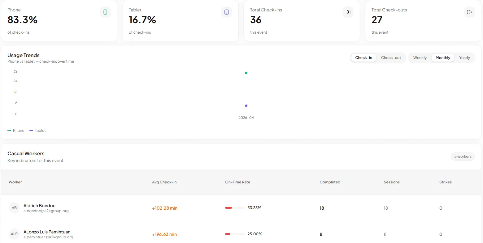
Section titled “Check-in device breakdown”Displays total check-ins and the split between Phone and Tablet (kiosk) check-ins, shown as percentages. Use this to understand which check-in method is most common across your events.
OTP usage
Section titled “OTP usage”A chart showing OTP codes requested versus used, available at both global and event-specific levels. Use this to identify events where workers are receiving but not using their login codes.
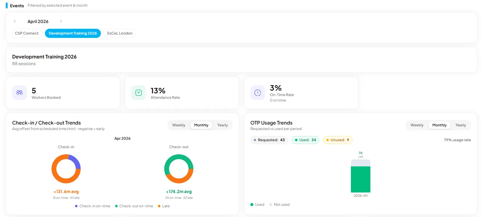
Event-specific section
Section titled “Event-specific section”Switch to a specific event using the tabs along the top (for example, 15 Feb · O2 Arena or 22 Feb · Wembley Stadium) to view event-scoped data.
Summary stats
Section titled “Summary stats”| Stat | What it shows |
|---|---|
| Total Workers | Number of casual workers registered across sessions |
| Total Sessions | Total number of sessions in the selected period |
| Avg Attendance Rate | Average proportion of booked sessions that workers attended |
| Avg On-Time Rate | Average proportion of sessions where workers checked in on schedule |
Charts
Section titled “Charts”Attendance & On-Time Rate by Role shows average rates grouped by role (for example, Security, Steward, First Aid, Crowd Management). Use this to identify which roles have lower attendance or punctuality.
Attendance & On-Time Rate per Session shows how both rates trended across sessions over time. Use this to spot patterns tied to specific events or dates.
Casual Workers table
Section titled “Casual Workers table”The table below the charts lists every casual worker with the following columns:
| Column | Description |
|---|---|
| Worker | Worker name and profile |
| Role | Assigned role |
| Status | Current worker status |
| Attendance Rate | Proportion of booked sessions attended |
| On-Time Rate | Proportion of sessions checked in on schedule |
| Sessions | Total sessions booked |
| Hours | Total hours worked |
| Joined | Date the worker joined the platform |
Use the All roles and All statuses filters to narrow the table. The worker count updates to reflect the current filter.
Individual worker view
Section titled “Individual worker view”Click any row in the Casual Workers table to open the worker’s performance side sheet.
Time range
Section titled “Time range”Use the 2W, 3M, and 1Y buttons at the top right to filter the worker’s data by the last 2 weeks, 3 months, or 1 year.
Summary stats
Section titled “Summary stats”| Stat | What it shows |
|---|---|
| Avg Check-In | Average minutes early (negative) or late (positive) relative to scheduled start |
| On Time | Percentage of shifts where the worker checked in on schedule |
| Shifts | Total shifts completed in the selected period |
Key Indicators chart
Section titled “Key Indicators chart”The chart plots check-in timing across shifts, showing minutes early or late versus the scheduled start. Use the tabs to switch between Check-In, Breaks, Checkout, and Response trend views.
Strikes and standing
Section titled “Strikes and standing”| Field | Description |
|---|---|
| Strikes | Number of strikes recorded against the worker (shown as coloured indicators) |
| Completed Shifts | Total shifts completed |
| Standing | Overall compliance standing (for example, Good) |
Prompt response
Section titled “Prompt response”Shows the worker’s average response time to manager prompts:
| Prompt type | Description |
|---|---|
| Location Request | Average time taken to respond to a location request |
| Liveness Check | Average time taken to complete a liveness check |
| Extended Hours | Average time taken to respond to an extended hours request |
Response times are colour coded: green indicates a fast average response, amber and red indicate slower response times that may warrant follow-up.
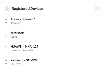
Registered devices
Section titled “Registered devices”The worker detail view includes a Registered Devices section listing all devices the worker has used to log in and check in. Each entry shows the device model (for example, iPhone 14, Samsung Galaxy S22). Use this to cross-reference device mismatch warnings on payroll and attendance records.